PEUGEOT
Client
PEUGEOT
Year
2025
Services
Branding & Visual Identity
Credits
In a partnership with BETC HAVAS
Peugeot
Refreshing a visual identity to connect heritage with a new generation.
Context
In 2025, Peugeot entered a new phase of brand evolution.
The goal was clear: become more relevant and expressive for younger, digitally native audiences — without losing the heritage, sophistication, and recognition built over decades.
At the same time, the identity needed to remain coherent within the Stellantis ecosystem and work consistently across global markets.
The challenge
The challenge wasn’t reinvention.
It was balanced.
The visual identity had to evolve without breaking its DNA, adapting to digital-first contexts, social platforms, and contemporary interfaces, while remaining unmistakably Peugeot across physical and institutional touchpoints.
The approach
The work started with a critical review of existing assets and guidelines, identifying where the identity felt rigid, outdated, or fragmented.
From there, the focus shifted to structure:
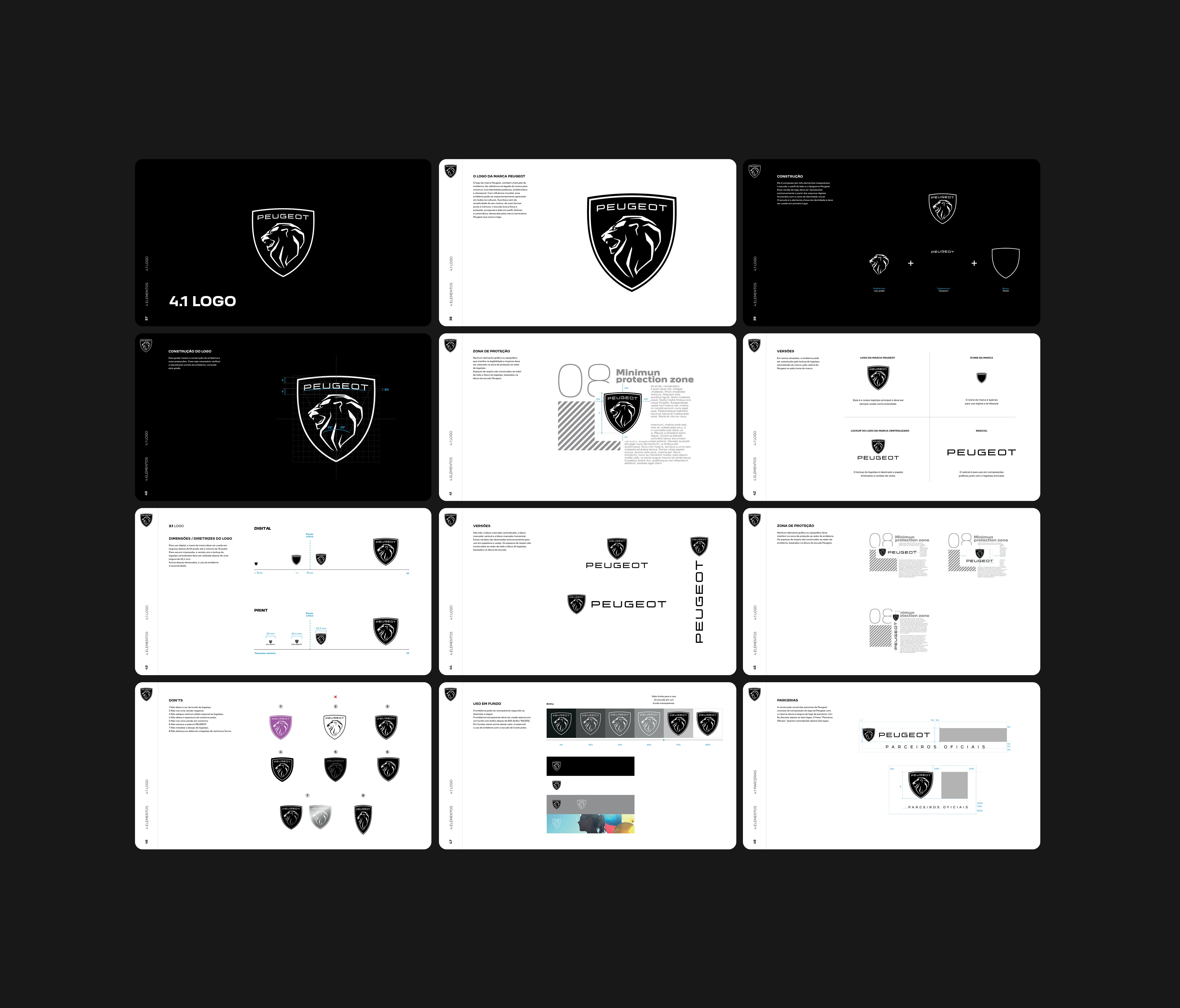
updating grid logic and layout behavior
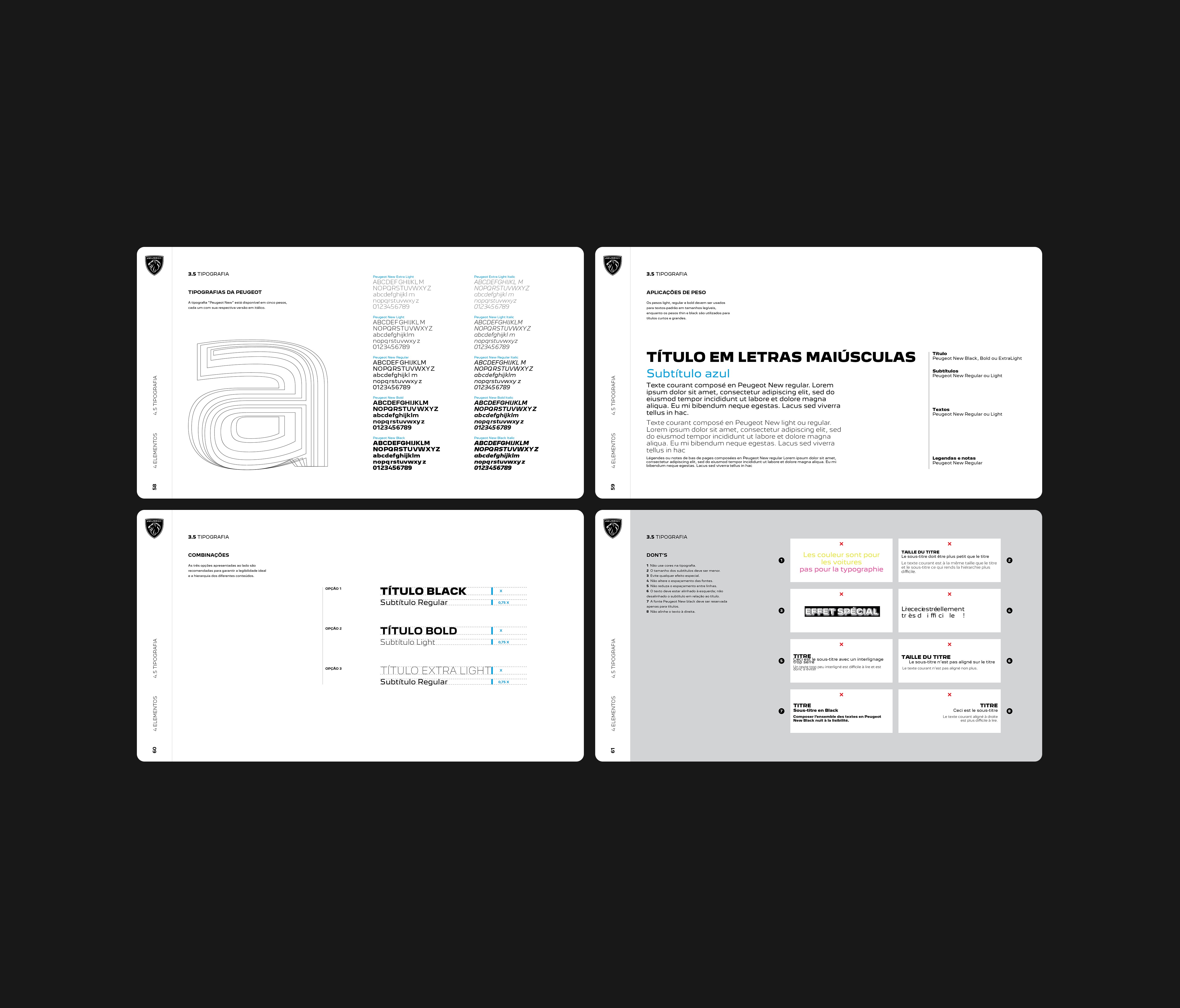
refining typographic hierarchy for digital use
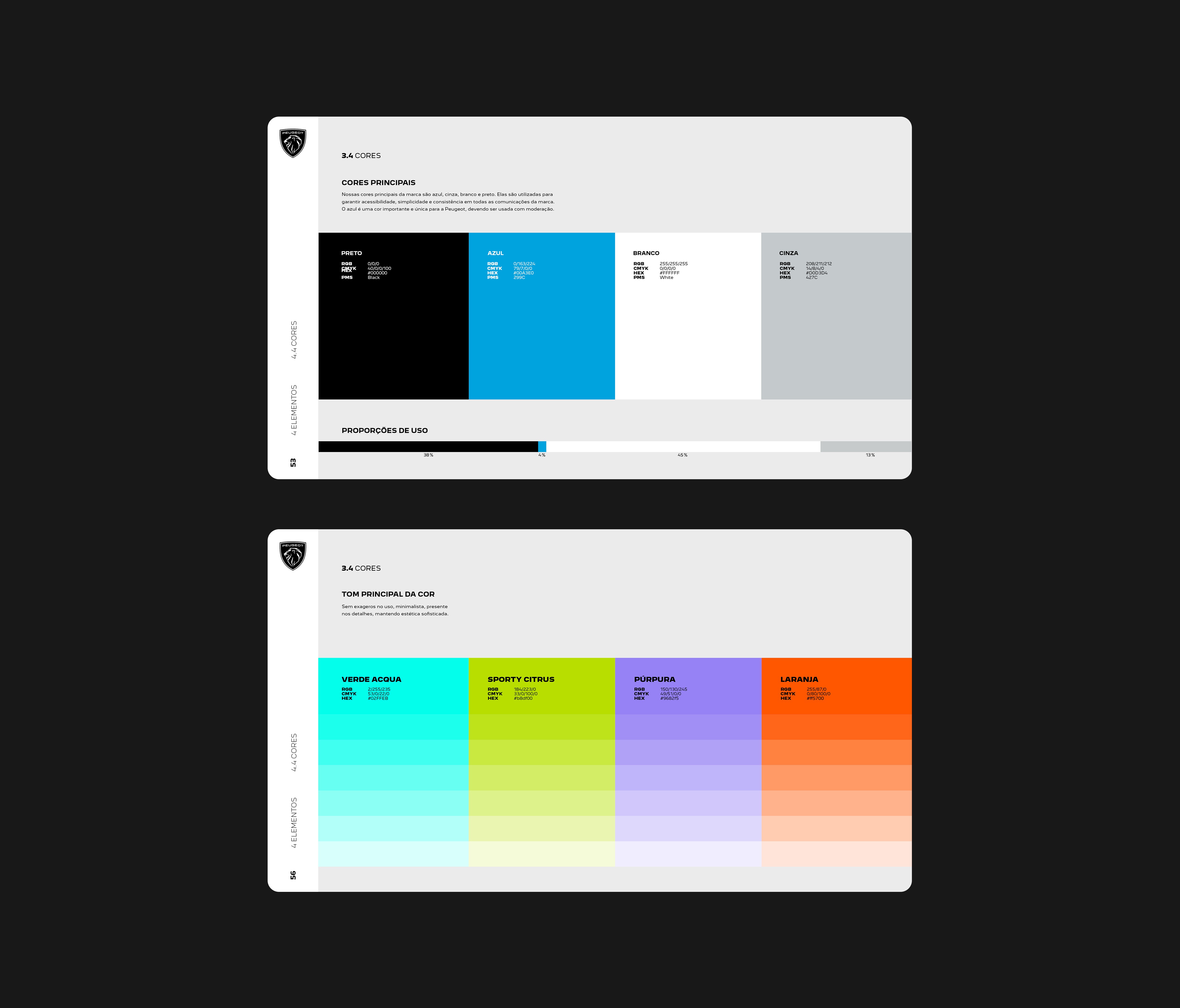
recalibrating color for better consistency across screens and print
Instead of relying on isolated visual choices, the identity was reorganized as a system of clear, connected design decisions.
My role
Brand & Visual Design Lead, responsible for redefining the visual language, updating layout logic, refining typography and color application, and aligning digital and traditional expressions under a unified visual approach.
Process
Review of existing visual assets and guidelines
Identification of gaps in contemporary visual expression
Redefinition of grid structures and layout logic
Refinement of typographic hierarchy and digital type usage
Color calibration for screen and print consistency
Integration of standards into a flexible guideline for teams and partners
Solution
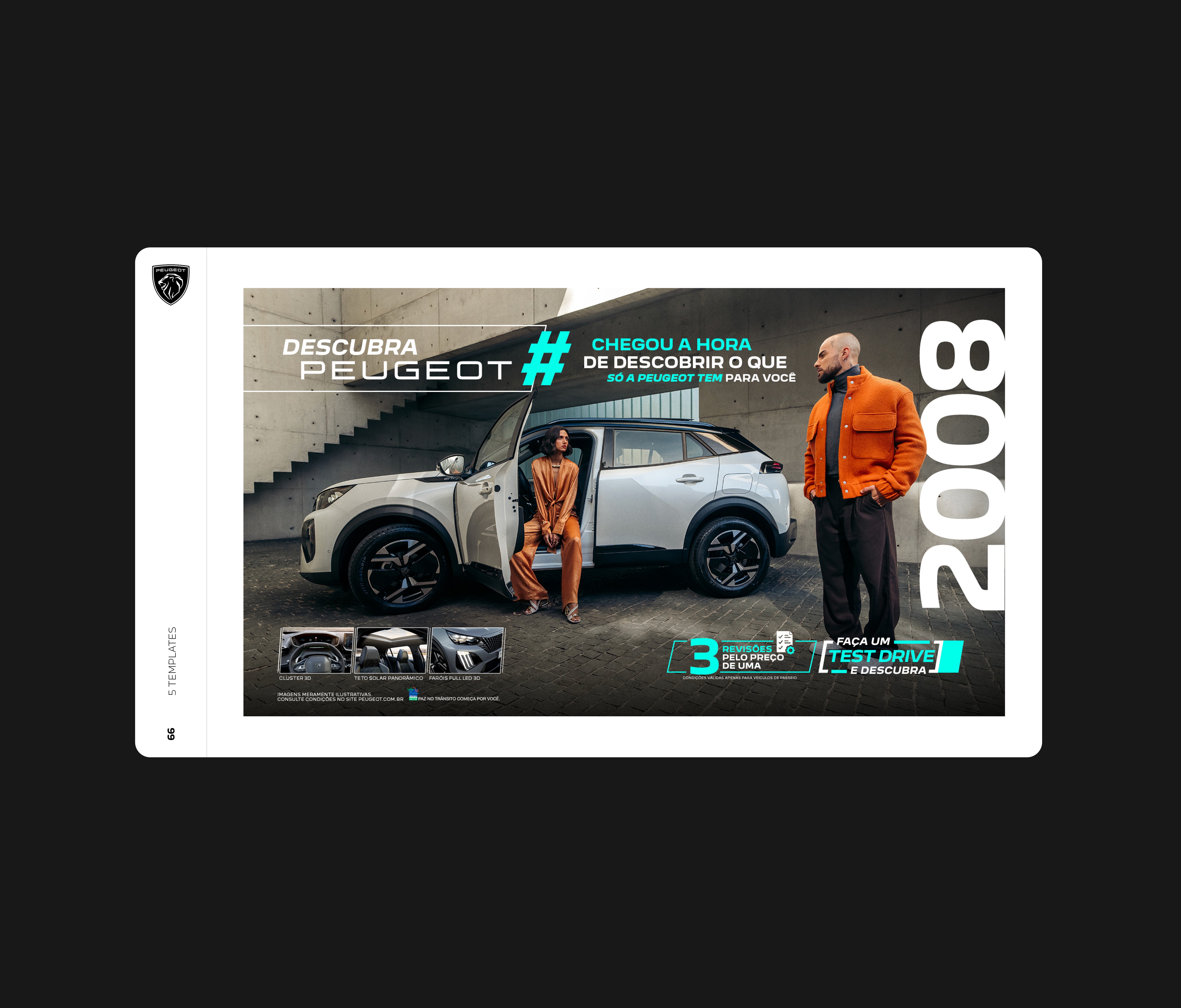
A refreshed visual identity that modernizes proportion, spacing, and typographic expression while preserving Peugeot’s core elements.
The system supports:
coherence across communications
adaptability across formats — social, web, editorial, and institutional
clear visual hierarchy
Relevance for younger, experience-driven audiences
The result is an identity that feels more contemporary, expressive, and versatile — without losing continuity.
Outcome
The updated visual language strengthened brand recognition across digital and physical touchpoints and improved clarity of execution for creative teams.
More importantly, it gave Peugeot the flexibility to respond more quickly to market shifts and audience expectations, while preserving its brand legacy and reinforcing its relevance with new generations.