Fasano
Client
Fasano
Year
2025
Services
Visual Identity Systems
Fasano
Designing a visual structure that reflects quiet luxury.
Context
Fasano needed an institutional presentation that felt as precise and restrained as the brand itself.
The challenge wasn’t creating something visually striking.
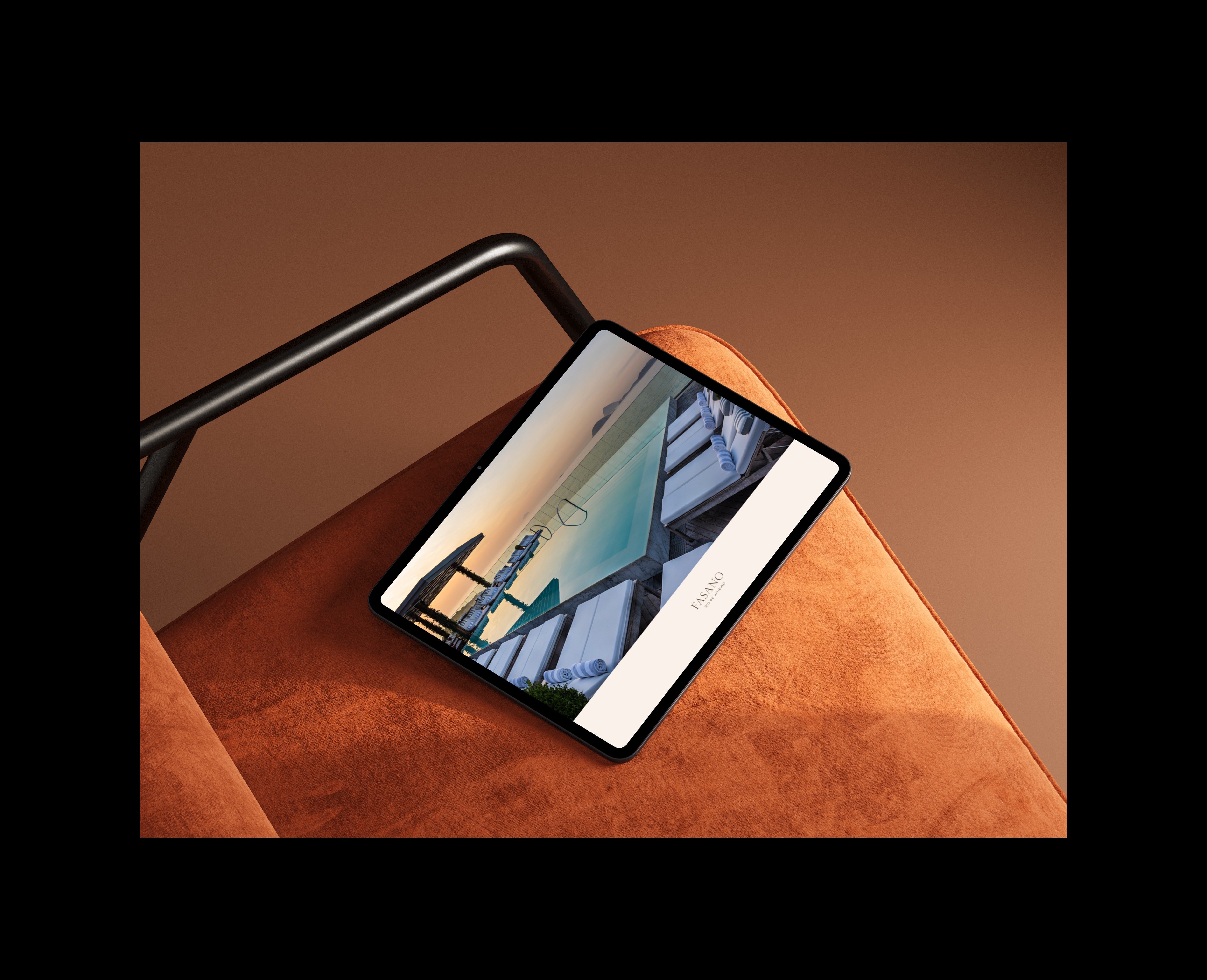
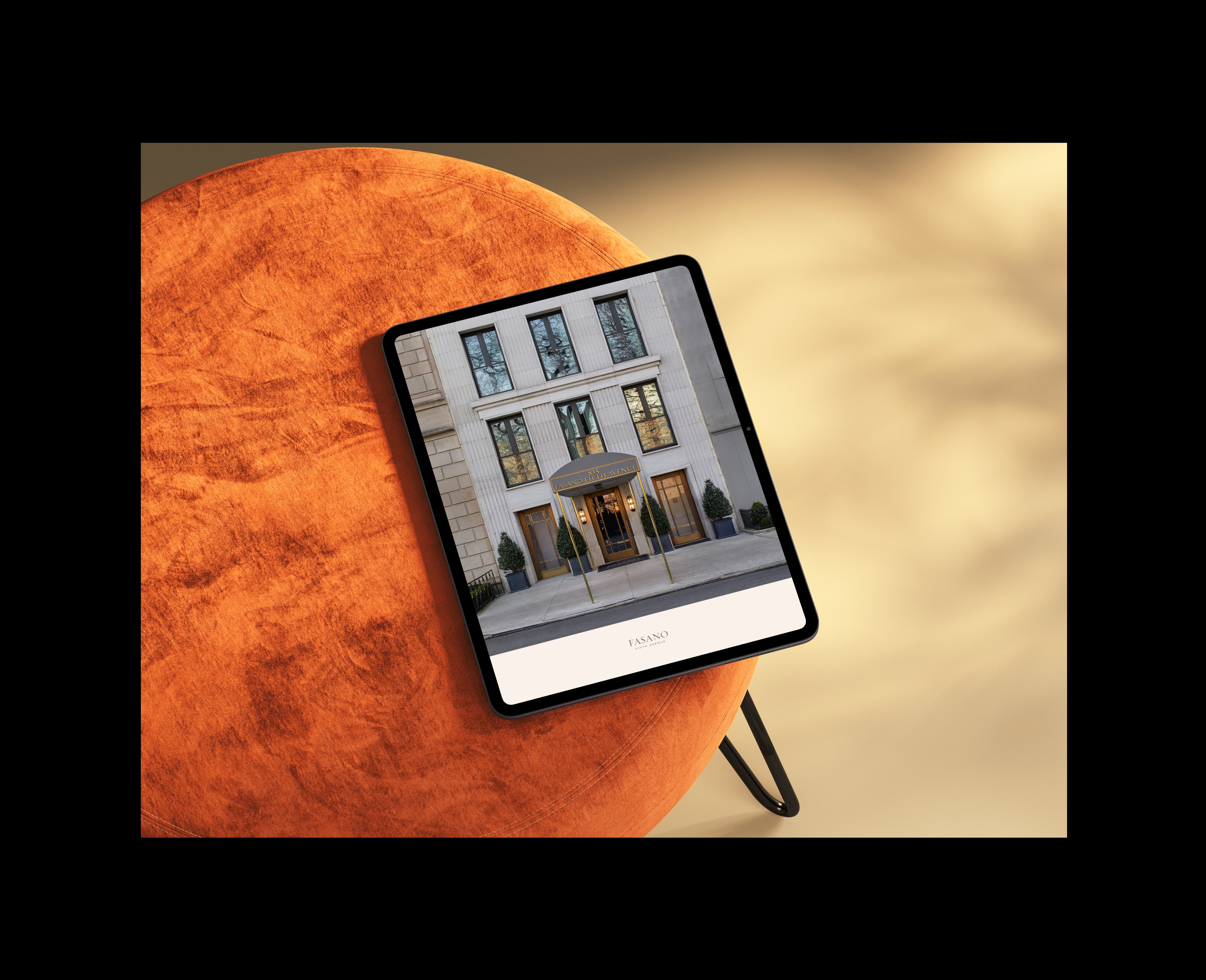
It was building a structure capable of supporting both print and digital formats while preserving the brand’s sense of proportion, elegance, and control.
Every element had to feel intentional, nothing excess, nothing decorative.
The challenge
The presentation needed to organize content with clarity and calm.
Text, images, and spacing had to coexist without competing for attention, resulting in a visual language that felt measured, balanced, and timeless.
The approach
The work focused on structure before surface.
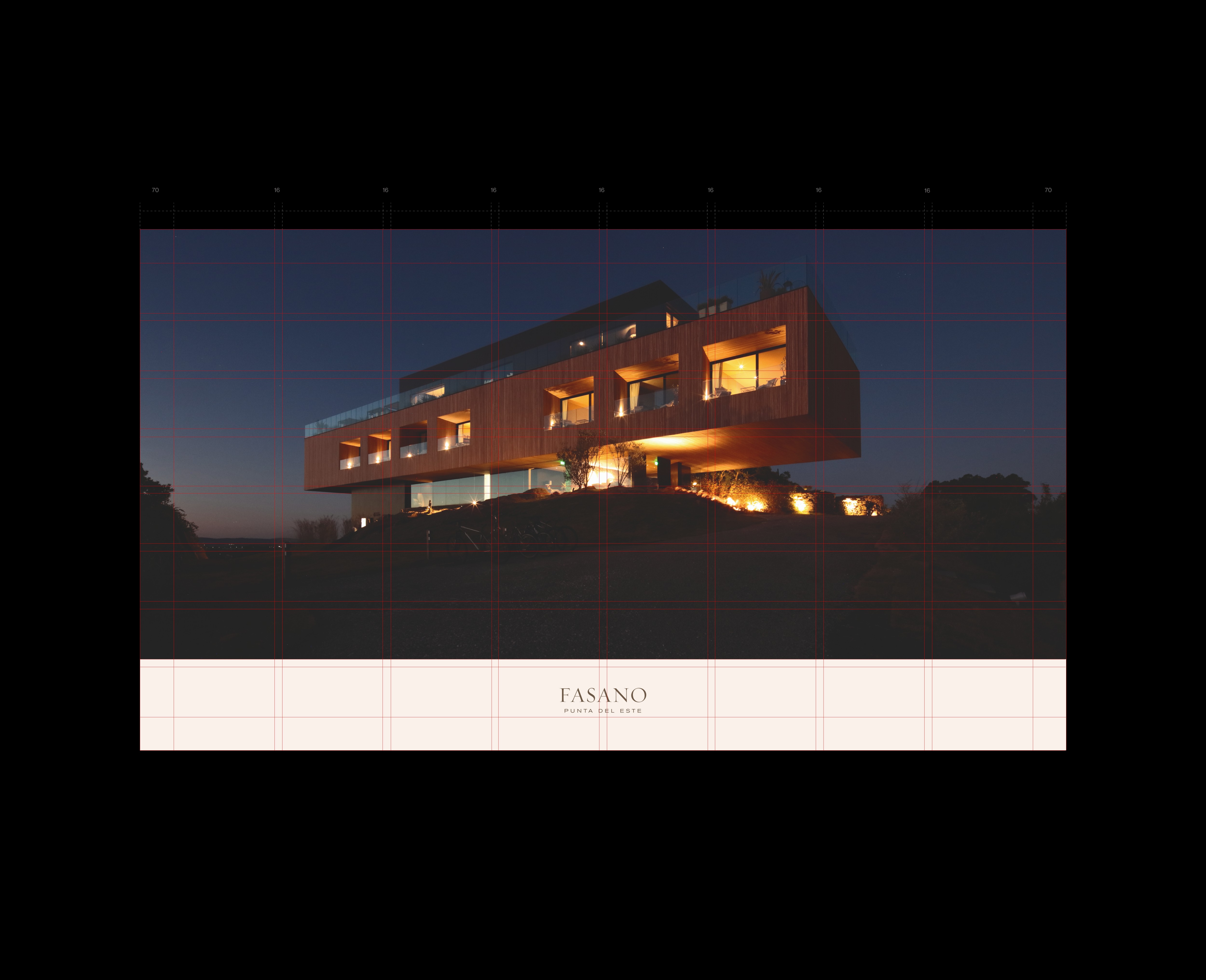
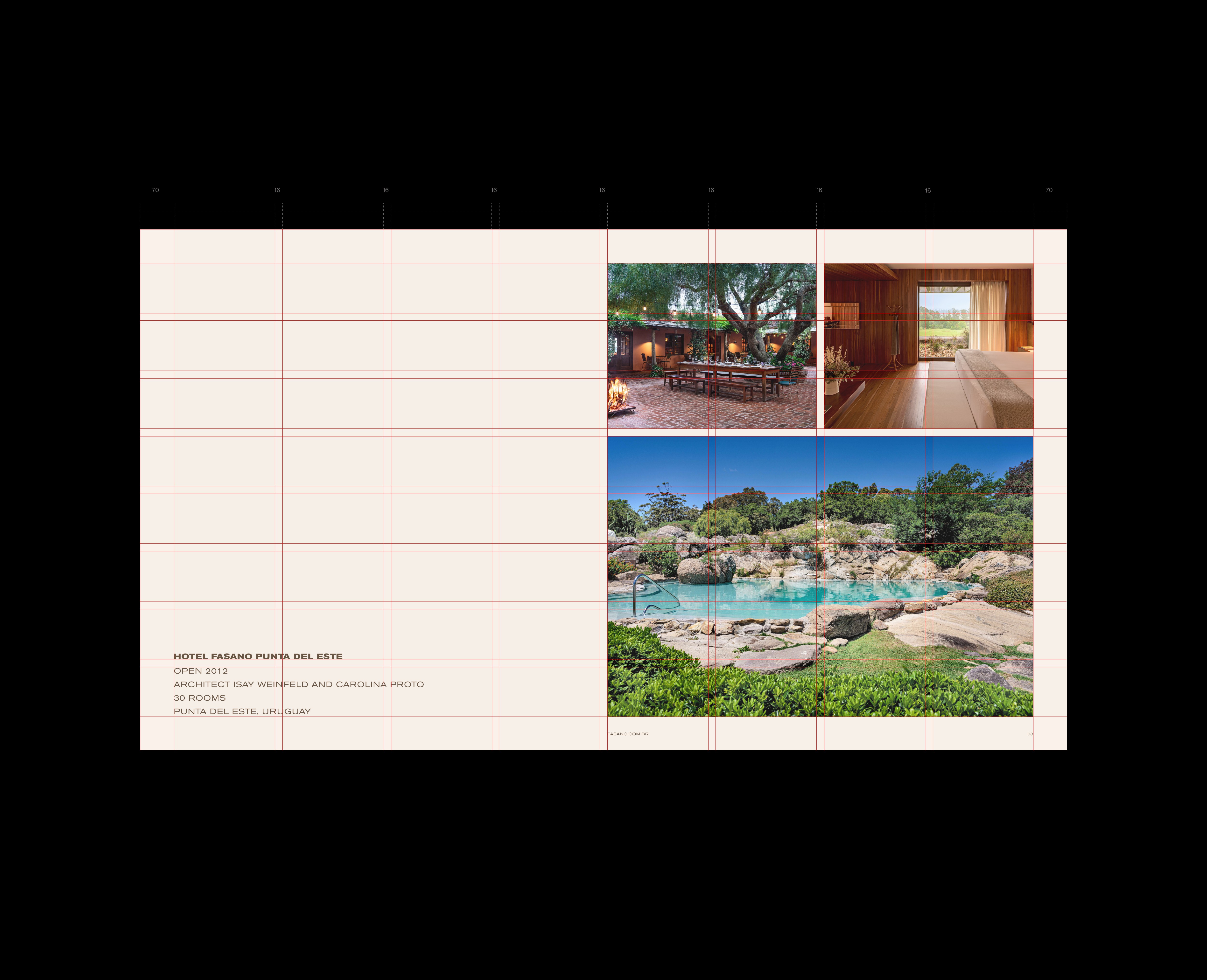
A modular grid was developed to control proportion, alignment, and spatial rhythm, establishing a consistent logic for how content behaves across layouts.
Typography, imagery, and white space were treated as equal elements, working together to create hierarchy without visual noise.
My role
Visual System Lead, responsible for defining the grid architecture, layout logic, typographic structure, rhythm, and spatial balance across the entire presentation.
Process
Definition of a modular grid to control proportion and alignment
Development of spatial rhythm and typographic hierarchy
Selection of refined typographic combinations
Careful balance between image and white space
Iterative layout refinement for print and digital contexts
Documentation of visual rules to ensure consistent application
Solution
A visual system anchored in a modular grid that acts as the backbone of the presentation.
Rather than drawing attention to itself, the grid operates quietly in the background, guiding alignment, stabilizing hierarchy, and ensuring visual equilibrium between content and space.
Every layout decision follows a clear, repeatable logic.
Result
The system delivered a cohesive and balanced presentation that reinforces Fasano’s premium positioning.
By establishing clear rules for proportion, alignment, and rhythm, the design improved clarity and usability across both print and digital formats, without compromising elegance.